I stumbled across an article on medium last week from the UX movement. The content was describing the paradox of Accessibility and Aesthetics.
Although I enjoyed reading this, I found my self disagreeing with the paradox the writer is expressing, and wanted to mention that we, designers, have a strong aesthetic bias which we need to acknowledge.
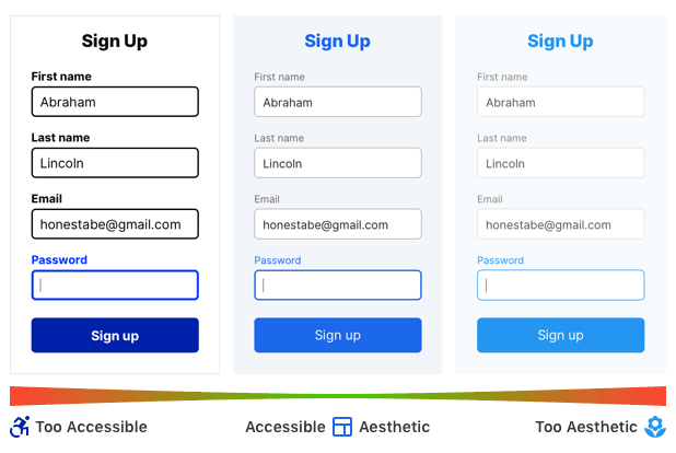
The Paradox
The example that the writer posted included two variations of a sign-up form attached bellow.
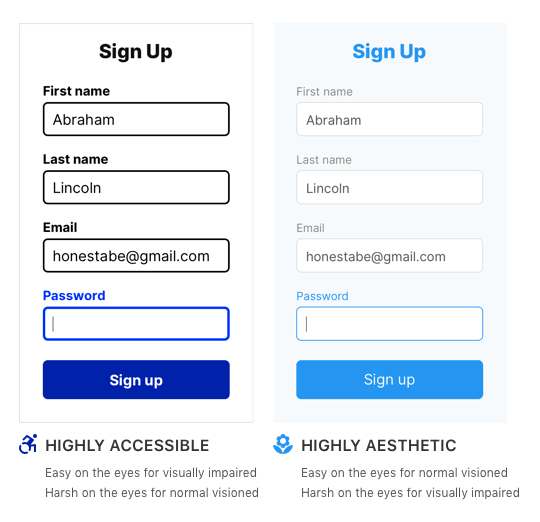
The blog post writer classified the left design variation as a highly accessible prototype with low aesthetics while the right one as highly aesthetic design and scoring low on accessibility.
Accessibility is a broader domain but let’s stay only in the font and contrast subset.
Who defined the left as a harsh on the eyes prototype for the normal visioned eyes?
The designer’s bias
We, as designers are highly biased from the designs of our community. We tend to scroll hours on Dribbble, check Awwwards every once and then, but we forget that we are not our users. Our users are probably not designers, and they do not have the same design taste as we do.
Validate the assumption of the UX movement
I got the aforementioned sign-up forms and tested them with the Clarity feature of VisualEyes.
I wanted to get fast how clear and aesthetically pleasant those designs are perceived from an average user.
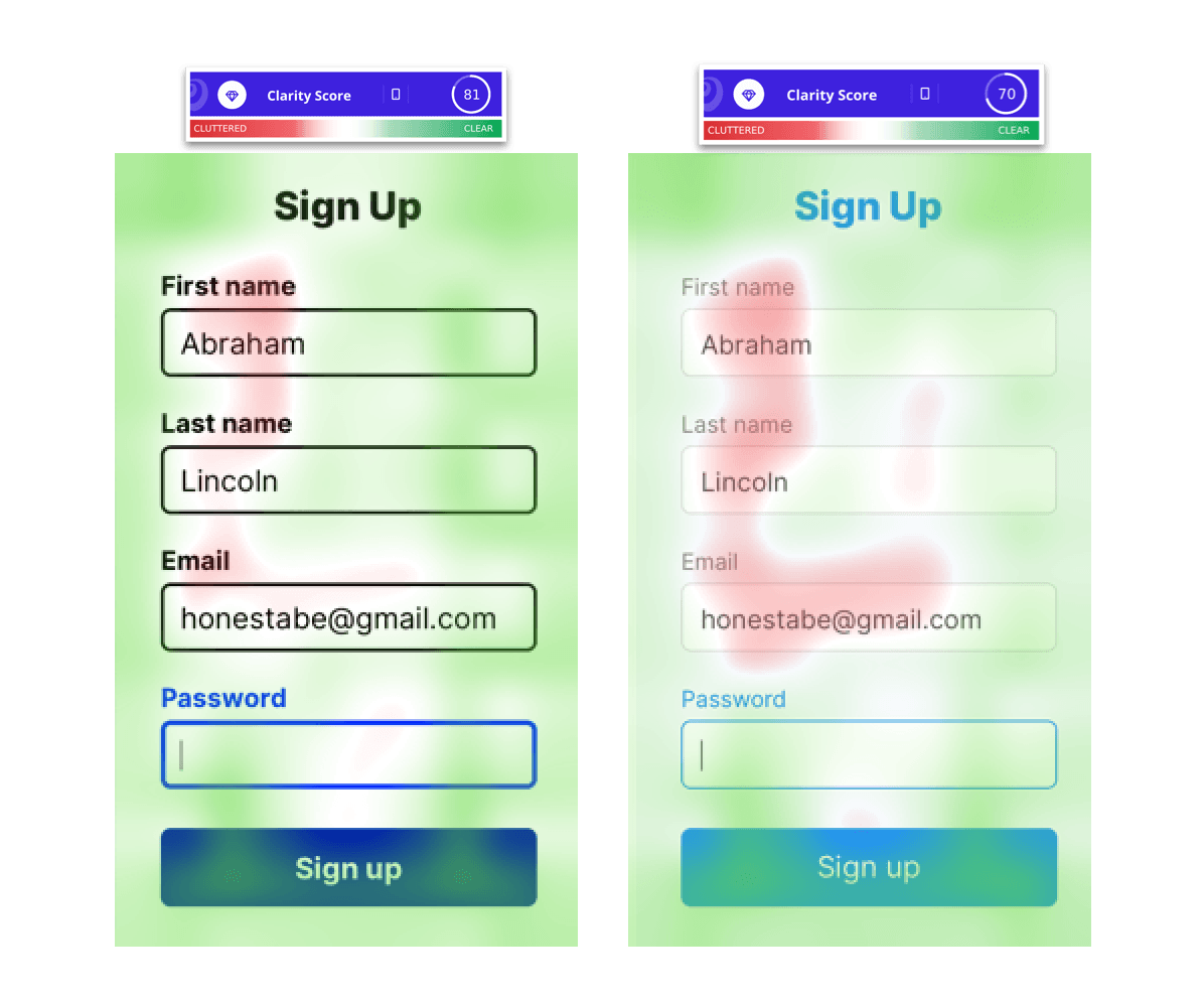
And then I got my results! The average user clearly prefers the first design, and me too, to be honest.
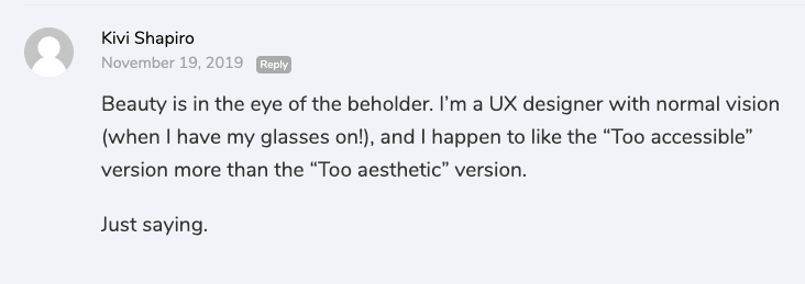
As designers, it’s our responsibility to put ourselves in our users’ shoes with one or another way. I tried to do this myself with predictive technology. Still, there are various other ways to do this, like usability testing, preference tests and ultimately A/B testing.
Low contrast does not mean beautiful
The next example is a modification of a Sketch landing page template I downloaded recently.
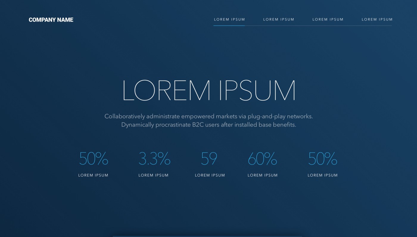
As soon as I opened it in my Sketch app, I noticed that the text was too thin for my taste, and the opacity was not working in my favour. I tweaked it, increased the opacity from 60% to 100% in the text below the headline and the stats, and changed the weight from Regular to Medium.
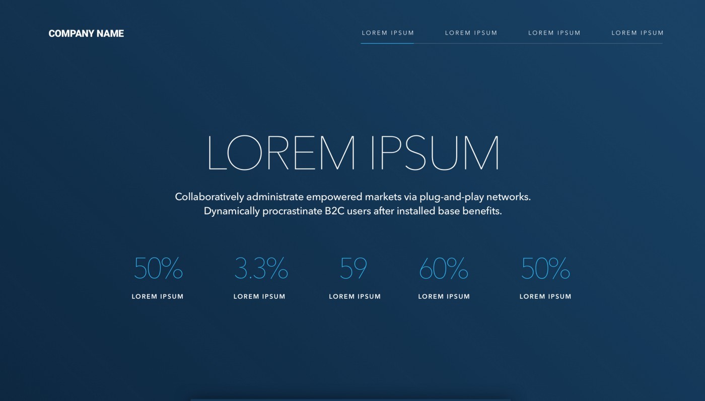
Curious about the results that VisualEyes predicted? If we trusted the irrational scale from the controversial blog post, we would predict that the Clarity Score should go lower than on the initial design.

The modified design, with higher contrast, and bolder text on the same background scored 6 units above the original, and is way more accessible to users!

Key take aways
We, designers and product managers, tend to see hundreds of designs every day. We seek inspiration in Dribbble, and we have a life goal to appear in Awwward’s list.
This daily routine is affecting our aesthetic criteria. I am not saying that those criteria are better or worse. Still, those criteria tend to be different than those of an average internet user. Not all of our users are designers, and we need to acknowledge this. Their taste is different, and sometimes it may feel strange that they do not appreciate our highly delicate designs.
And here is the question we have to ask ourselves:
Are we designing to please our ego, or to serve our users?
The question is rhetorical and the answer obvious.